Improving Websites: Current Investor Relations Trends
Find out what companies need to bear in mind when reviewing their IR website.

Since the introduction of MiFID II at the beginning of 2018, the digital IR landscape has changed, adapting to the consequences of the directive. The reduction in analyst coverage and research quality, in particular for small- and mid-caps, has meant that investors are increasingly turning to other digital channels to fill in the gaps and help them to make their investment decisions.
A company’s IR website is one of the most important sources of information available to investors; allowing them to understand your investment story, vision and strategy as well as access key financials.
At the recent IR Magazine Forum in Paris we attended, investors on several panels reiterated the importance of the corporate and IR website. They made it clear that getting it wrong can lead to investors, especially those prospecting the company, simply going elsewhere.
Companies are taking action to improve their website in the wake of MiFID II
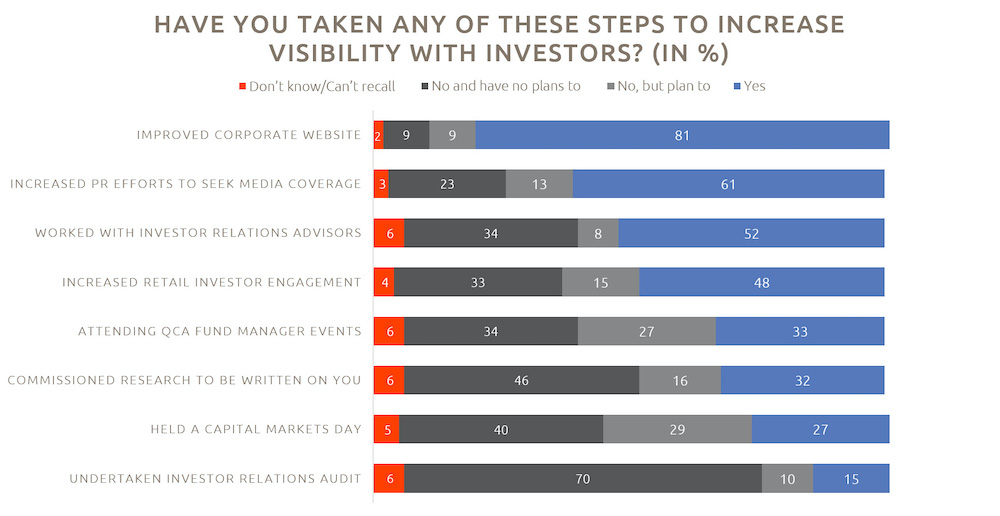
According to the 2019 QCA/Peel Hunt Mid and Small-Cap Investor Survey, around a third of investors said that companies should be improving their website. Interestingly the same survey also found that the majority of companies are already aware of the need to do so; 90% said that they have developed, or plan to develop, their website to improve visibility to investors, of which 81% are already taking steps to do so.
So what do companies need to bear in mind when reviewing their IR website? Below is a summary of the key factors to consider.

Source: 2019 QCA/Peel Hunt Mid and Small-Cap Investor Survey, page 41
How intuitive is your investor relations website?
If the content that conveys who you are and what you do isn’t easy to find and process, investors may not spend the time to figure out the message you are trying to relay and simply look elsewhere. Therefore, having user-friendly navigation is essential when it comes to winning over new investors.
Your content needs to be laid out in such a way that key information can be found in a couple of clicks. It’s worth putting yourself in the shoes of your different stakeholder groups to consider which content is most valuable to them, and then making sure that your website has clear signposts.
Don’t forget to use website analytics. This is a powerful tool for reviewing your IR website’s intuitiveness. It enables you to track traffic to your IR website and gain insights into what’s working and what could be improved both in terms of content and navigation.
Is your IR website optimised for mobile devices?
A recent article written by Statista states that 63% of people consider either their phone or tablet to be the most important device they use to connect to the internet, up from 52% in 2015. Similarly, a growing number of investors are using phones and tablets to view IR content. Therefore, it’s critical that your website enables investors to view your website and download key material, such as your investor presentations, on these devices. Ease of navigation is just as important for mobile and tablet as it is for desktop (if not more so) and so this needs careful consideration. Fewer menu options, less text and more visuals such as infographics are just some of the elements that can be helpful in this respect.
Other considerations include prioritising scrollable content which is more user-friendly on a mobile than clicking through multiple pages. It’s also worth making sure that links and buttons are easy to click on mobile devices, charts and videos are optimised and photos are high quality and closely cropped, all of this improves the user experience.
Is your content high quality and engaging?
The quality of the content on your IR website is key. Best practice is moving toward less text and more visuals to make websites more engaging and easier to absorb. Below are a few important points to think about.
- Your investment case needs to be visible, clear and compelling. This has become increasingly important since the introduction of MiFID II. According to a recent survey by Citigate Dewe Rogerson, 44% of IROs felt that the presentation of their investment case had room for improvement.
- Using infographics to present the key information relevant to investors and other stakeholders also allows you to succinctly communicate a snapshot of your company.
- Ensure your results and presentations archive is visible and has everything in one place without investors needing to click through to other pages. Annual reports, webcasts, presentations and videos all need to be there. Some companies also make their multi-year financials available in Excel to allow analysts to easily integrate the data into their models.
- Audio and video webcasting, while already a popular way of interacting with current and prospective investors, have become increasingly popular among small and mid-caps since MiFID II. Make recorded webcasts available on your IR website along with the presentation and a transcript for those who need to quickly find and pick out key pieces of information.
- In a similar way, videos can be a great way of conveying your company’s story on your website. More and more companies are leveraging short videos to communicate key information in an engaging way, including for the company’s strategy and results. Ensure up-to-date contact information for the IR team or key investor contacts can be easily found.
- Likewise, having an automated email alerts subscription form allows investors and potential investors to keep up with developments relating to your company with minimal effort.
Ultimately, the aim of the IR website is to clearly present your message and make sure that investors and other key stakeholders can quickly and easily access the information that they are looking for.
The trend towards optimising the IR website is evident. Clearly, reviewing a website takes time and resource. It is, however, sure to be time well spent. By providing comprehensive information on the website, you not only increase transparency but also calls with investors and other stakeholders are more focused on strategic matters where the IRO or investor contact can provide real value.
Move your IR communication forward!
With our EQS IR Tools you provide interactive experiences for your IR website


